
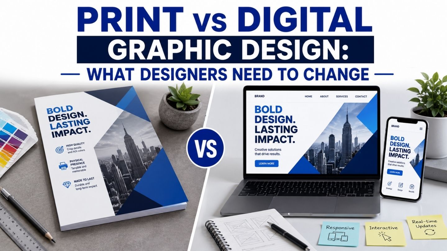
A logo that looks crisp on a retina display can turn muddy on a printed brochure, and colors that pop on screen can shift unexpectedly once ink hits paper. Print and digital design share a visual language and operate under genuinely different technical rules, and designers who only work in one medium often produce work that fails quietly in the other. This blog covers the specific technical differences that matter, where designers most commonly get caught out, and what actually needs to change when moving work between the two.
Key Takeaways
- Color models differ fundamentally between screen and print production.
- Resolution requirements are far higher for print than most digital work assumes.
- Bleed, trim, and safe zones have no digital equivalent and get frequently forgotten.
- Typography choices that work on screen can fail badly in physical print.
- A single asset rarely translates directly between mediums without real adjustment.
Working With a Print Vendor’s Specific Requirements
Beyond the general RGB-to-CMYK principle, individual print vendors and specific printing processes- offset versus digital, different paper stocks, different ink systems- can each introduce their own particular color behavior that a general rule won’t fully predict. Requesting a vendor’s specific color profile or ICC guidance before finalizing a design, rather than relying purely on standard CMYK conversion, catches vendor-specific variance that generic guidance misses.
This is particularly worth doing for any print run where color accuracy genuinely matters to the brand, since the cost of a wasted print run over a color mismatch usually far exceeds the small amount of extra time it takes to confirm the vendor’s specific requirements upfront.
The Color Model Problem
Screens display color using RGB, light combining to create color, while print production uses CMYK, ink layered onto paper to absorb and reflect light. These are fundamentally different physical processes, and colors that look vibrant in RGB frequently shift, sometimes dramatically, when converted to CMYK for print, particularly bright blues, certain greens, and neon tones that RGB can display but standard CMYK printing simply can’t reproduce accurately.
Designing directly in CMYK from the start for anything destined for print avoids an unpleasant surprise at the proofing stage, rather than designing in RGB and hoping the conversion holds up. For brand colors that need to stay genuinely consistent across both mediums, a Pantone spot color reference alongside both RGB and CMYK values gives print production a precise target rather than leaving the exact shade to whatever the conversion process happens to produce.
Resolution Requirements Are Not the Same

Digital design generally works comfortably at 72 to 150 dpi, since screens don’t have the resolving power to benefit from more detail than that. Print requires considerably more, typically 300 dpi at the final printed size, and an image that looks perfectly sharp on a website can look visibly pixelated or blurry once printed at a larger physical size, because the underlying pixel density simply isn’t sufficient for the medium. This is where why icon design matters in modern user interfaces becomes relevant too; small graphic elements are especially prone to resolution problems when moved between digital and print contexts.
This catches designers off guard, specifically when reusing web assets for print without checking; a logo pulled directly from a website often has nowhere near the resolution a large-format print application needs. The fix is maintaining source files at print-appropriate resolution from the start, or working from vector formats wherever possible, since vector graphics scale to any size without the resolution ceiling raster images run into.
Bleed, Trim, and Safe Zones
Print production involves physical cutting, and that process isn’t perfectly precise, which is why print design requires bleed, extending background colors and images slightly past the final trim line so any minor cutting variance doesn’t leave a visible white sliver at the edge. Digital design has no equivalent concept; screens don’t get physically cut, and designers without print experience frequently forget to build it in.
Alongside bleed, safe zones keep important text and content a reasonable margin away from the trim edge, protecting against the same cutting variance actually clipping something meaningful. Forgetting either of these is one of the most common and most visible print production mistakes, and it’s specifically a print consideration with no digital parallel to build the habit from.
Always Request a Physical Proof for Major Print Runs
A digital proof on screen can’t fully predict how color, paper stock, and finish will actually look once printed. For any significant print run, a physical proof catches problems a screen simply can’t reveal.
Typography Behaves Differently Across Mediums
Thin font weights that render crisply on a high-resolution screen can become fragile or nearly illegible when printed, particularly at smaller sizes or on absorbent paper stock where ink spreads slightly beyond the intended letterform. Similarly, very tight letter spacing that reads fine digitally can visually clog when printed, an effect that’s hard to predict without direct print experience.
Print also demands more conservative minimum sizes for body text and fine print, since a reader can’t zoom in on a printed page the way they can on a screen. Designers moving between mediums need to actively reconsider type choices rather than assuming a system that reads well digitally will translate directly, and this is closely related to the same underlying principles covered in accessibility considerations in graphic design; legibility constraints that matter for accessibility digitally often matter just as much, for different physical reasons, in print.
File Formats and Handoff Requirements
Digital work commonly hands off as web-optimized JPEGs, PNGs, or SVGs, formats built for fast loading and screen display. Print production needs entirely different formats, typically high-resolution PDFs with embedded fonts and CMYK color profiles, or native design files a print shop can work from directly. Sending a web-format file to a print vendor, or a print-ready file to a web developer, causes friction and delay that a quick format check upfront easily avoids.
This extends to embedding fonts and flattening or outlining text appropriately for print, so the final file doesn’t rely on the print shop having the exact same fonts installed that the designer used. It’s a small technical step that prevents a surprisingly common and completely avoidable print production failure.
What Actually Transfers Well Between Mediums

Despite these differences, the underlying brand identity, core logo concept, typography personality, and color philosophy should stay consistent across both mediums even as the technical execution adapts. The goal isn’t two disconnected identity systems; it’s one coherent identity expressed correctly within each medium’s actual technical constraints, which is a genuinely different task than simply exporting the same file twice.
This is where understanding the different roles within graphic design becomes practically relevant; print and digital design increasingly benefit from at least someone on a team who understands both sets of technical requirements deeply, rather than assuming skill in one automatically transfers competently to the other.
Building a Reference Sheet for Your Team
Rather than relying on any single designer to remember every print-specific technical requirement, a short internal reference sheet- correct color profiles, minimum resolution by output size, standard bleed and safe zone measurements- prevents the most common mistakes from recurring across different projects and different team members handling print work over time.
This is particularly valuable for teams primarily focused on digital work who only occasionally take on a print project. Without a documented reference, print-specific requirements that were learned once tend to be forgotten by the next project, and the same avoidable mistakes resurface each time rather than the team’s print competence actually accumulating.
Designing for the Medium, Not Just the Message
Print and digital design share a visual vocabulary and diverge sharply on the technical execution beneath it; color models, resolution, bleed and safe zones, typography behavior, and file handoff requirements are all genuinely different disciplines wearing the same creative surface. Producing work that holds up in both means respecting those differences deliberately rather than assuming a file that looks right on screen will translate automatically once it becomes physical.
At The Ocean Marketing, our graphic design services cover both mediums properly, with production knowledge that prevents the print-specific failures a purely digital background often misses. Whether you need help preparing assets for a print run, building a brand system that works across both mediums, or a free SEO audit to see how your digital presence performs, our team can help. Contact us and let’s make sure your next print piece comes out the way it looks on screen.