
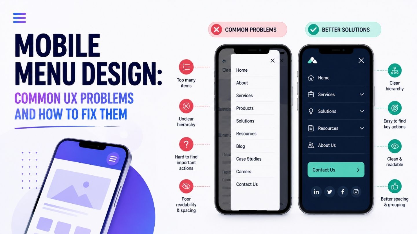
The hamburger icon has been the default answer to mobile navigation for over a decade, and defaulting to it without thinking has produced a lot of menus that technically work and quietly frustrate everyone who uses them. Small tap targets, hidden search bars, navigation that takes three taps to reach the one link someone actually wanted. These aren’t exotic failures; they’re the norm on a huge share of business sites. This blog covers the specific UX problems that show up most often in mobile menus and the practical fixes for each.
Key Takeaways
- Tap targets smaller than the recommended minimum cause real, measurable friction.
- Hiding search behind an extra tap loses people who arrived with clear intent.
- Deeply nested menus bury important links behind too many decisions.
- Sticky elements competing for space push content further down the screen.
- Testing on an actual phone catches problems desktop review never will.
Tap Targets That Are Too Small to Hit Reliably
A menu item that looks perfectly clickable on a desktop mockup can be genuinely difficult to hit accurately with a thumb on a real phone, particularly for anyone with larger hands, a tremor, or simply using their phone on a moving bus. The common guidance is a minimum tap target around 44 by 44 pixels, and plenty of mobile menus, especially ones ported over from a desktop design without real reconsideration, fall well short of that.
The fix is straightforward once identified: audit actual tap target size, not just visual size, since padding around a small visible icon can extend the tappable area without changing how it looks. Test on a real device rather than a browser’s mobile emulator, which doesn’t replicate the actual physical difficulty of a genuine thumb tap the way holding an actual phone does.
Testing Whether Search Placement Actually Matters for Your Site
Not every site benefits equally from prominent mobile search, and assuming it does without checking your own data can lead to prioritizing a fix that doesn’t actually move the needle for your specific audience. Checking how often site search is used relative to overall mobile traffic gives you a genuine basis for deciding how much priority this particular fix deserves against other competing improvements.
For sites where search usage is genuinely low, the effort might be better spent elsewhere in the mobile experience. For sites where it’s a meaningful share of engaged behavior, the fix deserves real priority. Either way, checking the actual data beats assuming based on general best practice alone.
Search Buried an Extra Tap Away
Someone who opens your mobile menu specifically looking for search has already shown clear intent, and making them tap the menu, then tap a search icon, then tap into a field before they can type anything adds friction at exactly the moment they were most ready to act. Every additional tap between intent and action loses a measurable percentage of people.
Where the site’s content and traffic patterns support it, putting a visible search field directly in the mobile header, rather than hidden behind the hamburger menu, removes an entire step for a genuinely common use case. This isn’t universal advice; a site with little internal content to search may not need it prominently, but for anything with meaningful depth, hidden search is a common and fixable source of lost intent.
Navigation Buried Too Many Levels Deep
Menus that mirror a desktop’s full nested category structure often translate poorly to mobile, where each level of nesting means another full-screen tap-through rather than a hover reveal. A link that took one hover on desktop can take three deliberate taps on mobile, and each tap is another point where someone might give up rather than continue.
The fix usually means genuinely rethinking the hierarchy for mobile rather than just restyling the same structure. What are the two or three things most mobile visitors actually need quickly? Surface those directly rather than nesting them at the same depth as everything else. This connects to broader thinking about click depth and why it matters; the same principle that hurts crawlability also hurts a real person’s patience on a small screen.
Flatten for Mobile, Even If Desktop Stays Deep
A mobile menu doesn’t have to mirror desktop navigation exactly. A flatter structure specifically for the mobile breakpoint, surfacing the most-needed links higher, often serves visitors better than architectural consistency for its own sake.
Sticky Elements Competing for Limited Space

A sticky header, a sticky “add to cart” bar, a cookie banner, and a chat widget can each individually make sense and collectively consume so much vertical space on a small screen that very little of the actual content remains visible at once. Mobile screens have far less room to spare than desktop, and every persistent element competing for that space costs real content real estate. This is part of a broader above-the-fold design conversation about what Google and users actually expect, since sticky elements eat directly into that limited initial view.
Audit what’s actually sticky on mobile specifically, since some elements make sense sticky on desktop and become disproportionately costly on a six-inch screen. Prioritize ruthlessly: if two sticky elements are both fighting for the same strip of screen, one of them probably shouldn’t be sticky at all on mobile, even if it stays that way on desktop.
Menus That Don’t Signal Where You Are
On desktop, breadcrumbs and highlighted navigation states help orient a visitor within a site’s structure. On mobile, this orientation frequently gets dropped entirely to save space, leaving visitors unsure whether they’re on a category page, a product page, or somewhere else without scrolling up to check. That disorientation adds a small but real cognitive cost to every interaction.
A simple current-page indicator within the mobile menu, or a condensed breadcrumb that doesn’t consume much vertical space, restores that orientation without costing much screen real estate. It’s a small addition that disproportionately helps visitors who arrived via a search result deep in your site structure rather than through your homepage, which on mobile is an increasingly large share of all traffic.
Testing With a Thumb, Not a Cursor
The single most reliable way to catch these problems is testing on an actual phone, held the way a real person holds one, using only a thumb, ideally one-handed since that’s how most mobile browsing actually happens. Desktop review, even with a responsive preview pane, misses the physical reality of tap accuracy, reach, and the genuine impatience of mobile browsing in a way no amount of careful desktop review replicates. This kind of hands-on testing is exactly what separates quality web design from a merely adequate one for small businesses; the difference rarely shows up in a desktop review.
Do this test periodically, not just at launch. Menus accumulate additions over time: a new promotional banner here, an extra nav item there, and each addition individually seems minor while collectively degrading the mobile experience that was carefully tested once and never revisited. A recurring five-minute phone check catches this drift before it compounds into a genuinely frustrating experience.
Watching for Menu Bloat Creeping Back In
A mobile menu that’s been carefully audited and trimmed doesn’t stay that way automatically. New promotional links, seasonal campaigns, and additional service pages accumulate the same way they did the first time, and without a deliberate gatekeeping process, the same sprawl that prompted the original audit reappears within a year.
Assigning ownership- someone specifically responsible for approving additions to the mobile navigation rather than allowing anyone to add a link whenever it seems useful- keeps the discipline from eroding. It’s a small process addition that protects a meaningful amount of prior design work from being undone gradually and invisibly.
Building Mobile Navigation That Respects the Screen
Mobile menu problems are rarely dramatic failures; they’re an accumulation of small frictions: tap targets slightly too small, search buried an extra tap deep, navigation nested too many levels, sticky elements crowding the screen, that together make a site feel harder to use than it needs to be. Fixing them is mostly a matter of testing deliberately on a real device and being willing to genuinely restructure for mobile rather than just restyling the desktop version smaller.
At The Ocean Marketing, we build Website Design with mobile navigation treated as its own design problem rather than an afterthought. Whether you need a mobile UX audit of your current menu, help restructuring navigation for a genuinely mobile-first experience, or a free SEO audit to see how your site performs overall, our team can help. Contact us and let’s find out where your mobile visitors are getting stuck.